MONEY.
WITH FEELING.
Picnic needed a more distinctive presence in consumer fintech. I built a recognisable identity and a campaign language the team could use across messages and formats.
Give a consumer fintech a more distinctive identity and campaign language.
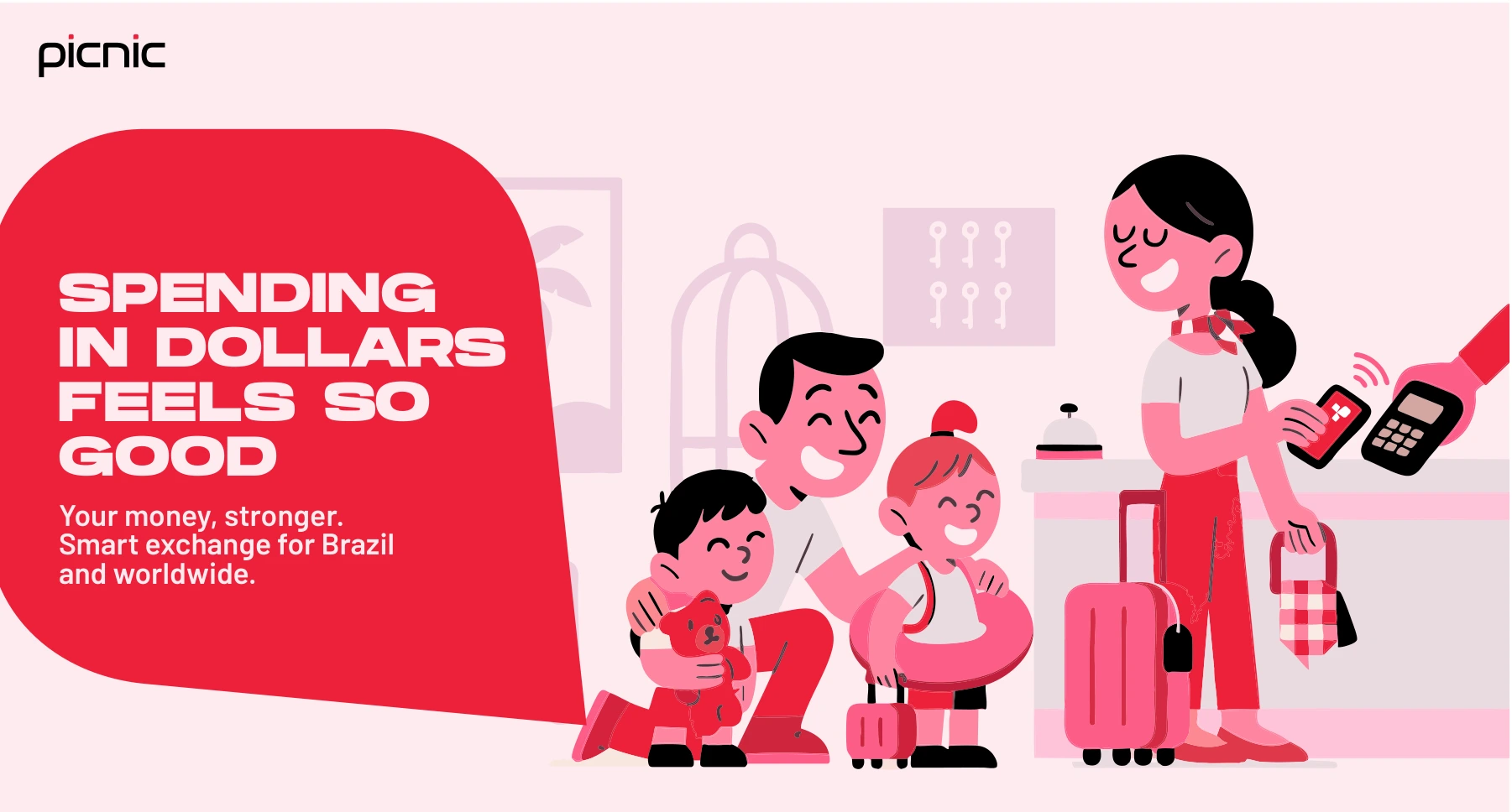
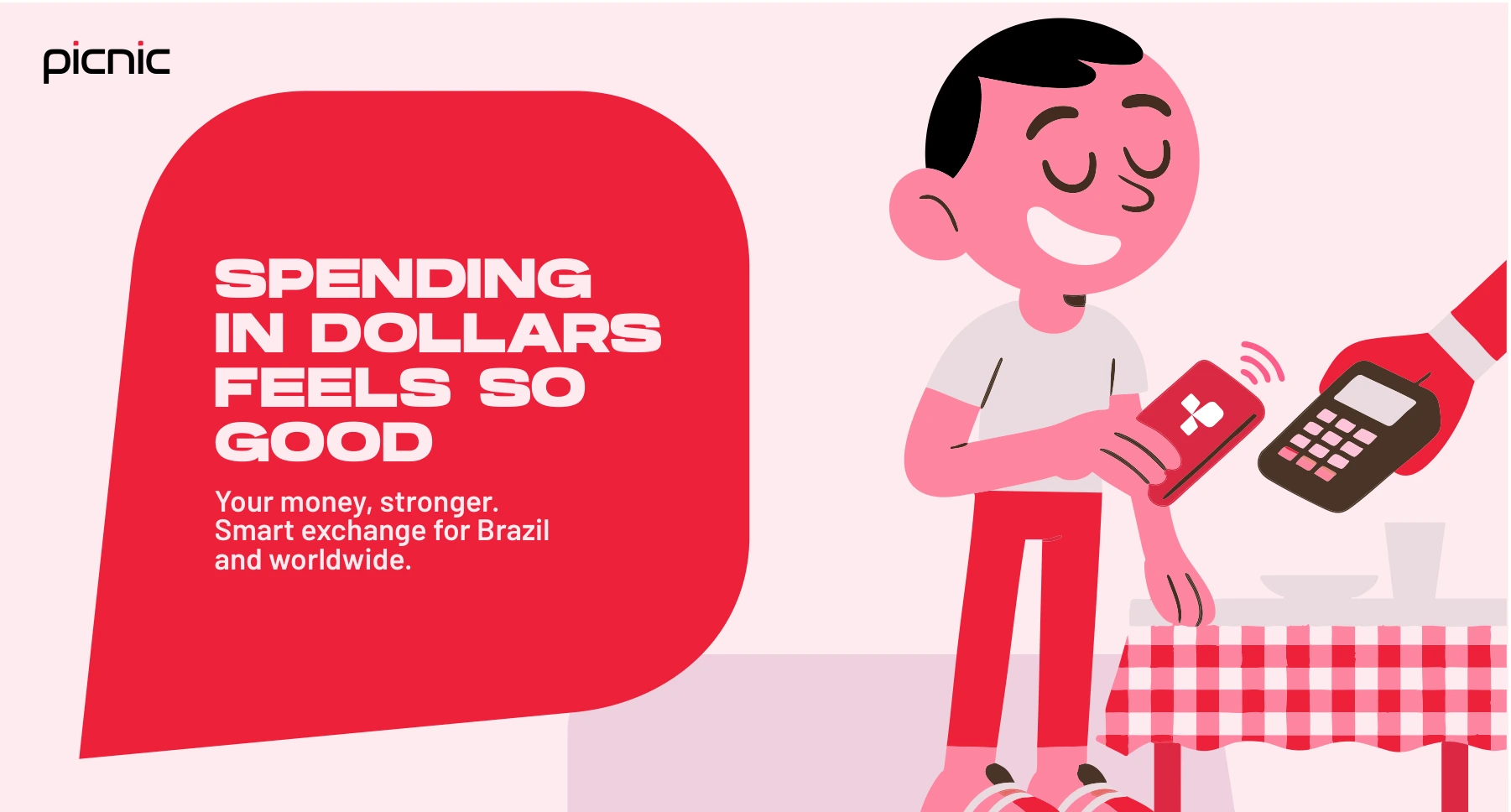
Refreshed identity, repeatable pattern, English and Portuguese messaging explorations, and marketing layouts.
A look of its own.
A system to repeat.
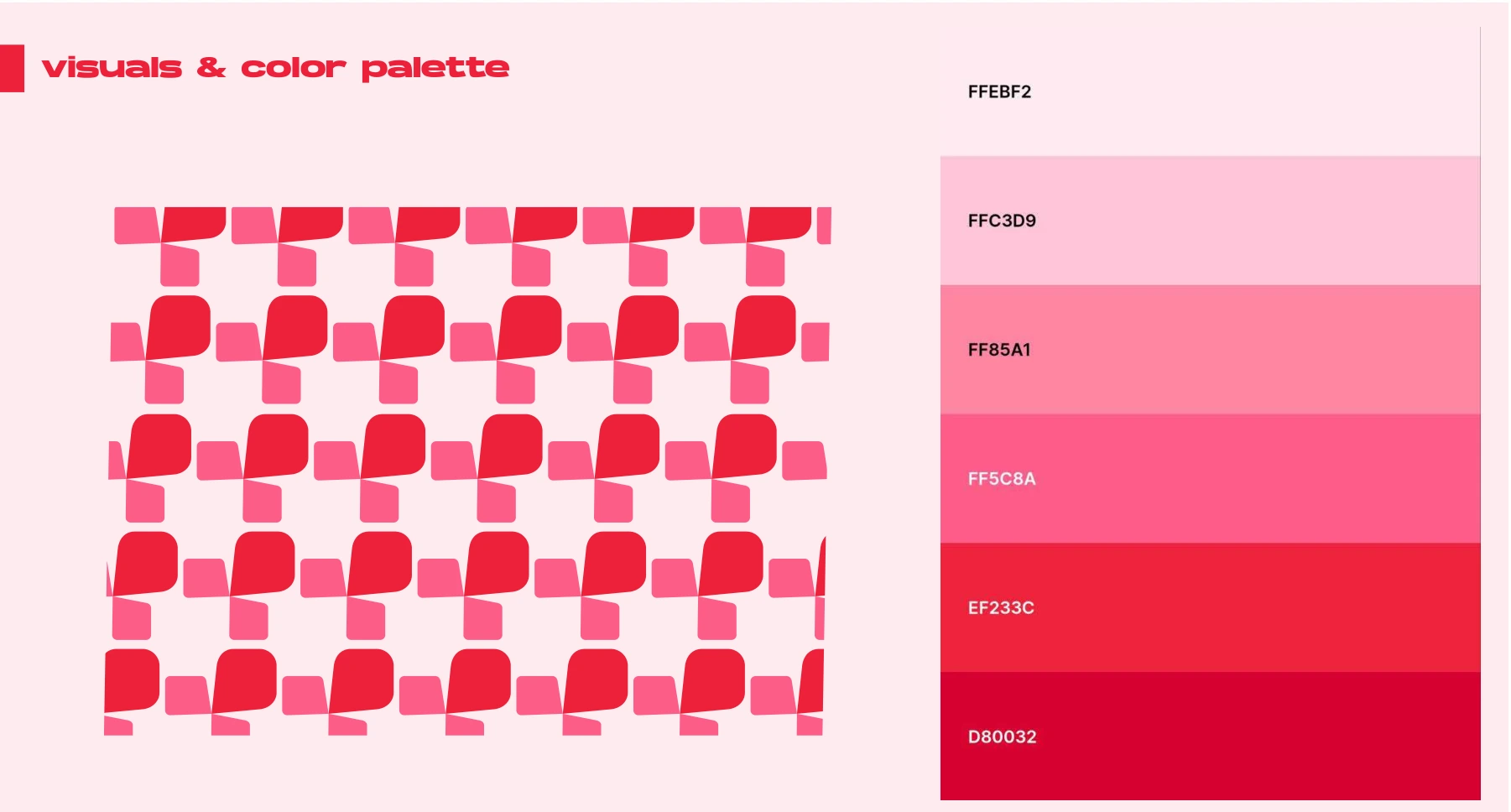
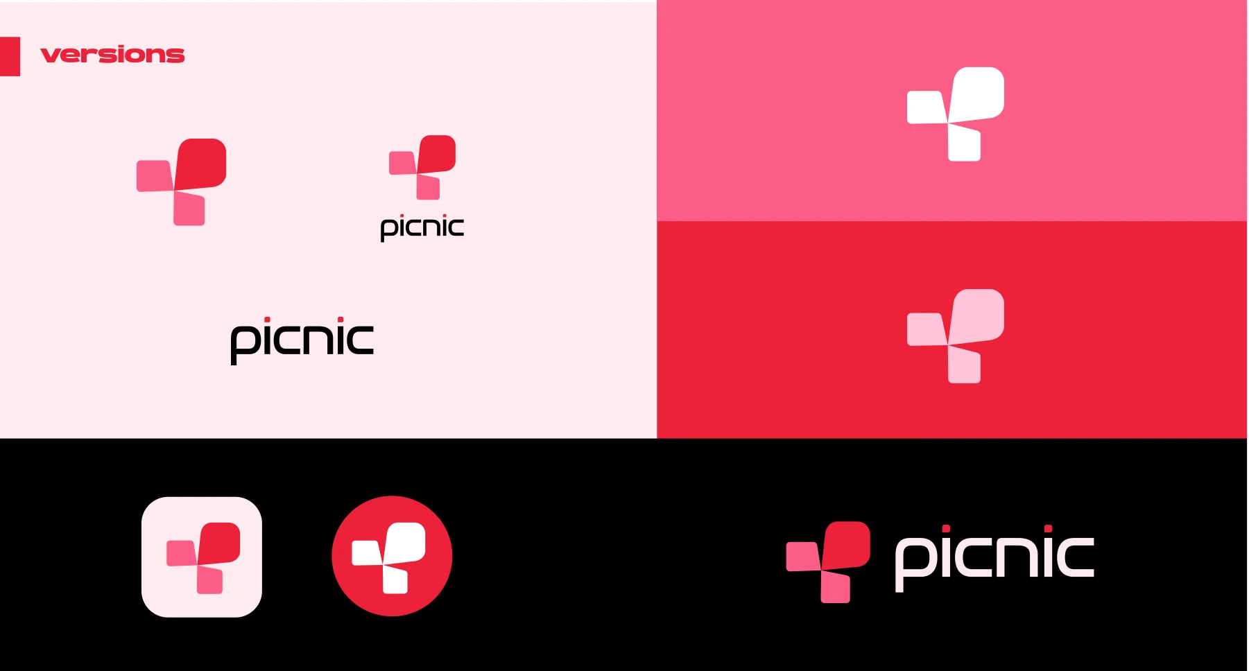
The refresh gave Picnic a distinctive red and pink palette, a symbol derived from its name, and a pattern that carries the identity into new layouts. Campaigns can change their message while keeping a recognisable family resemblance.
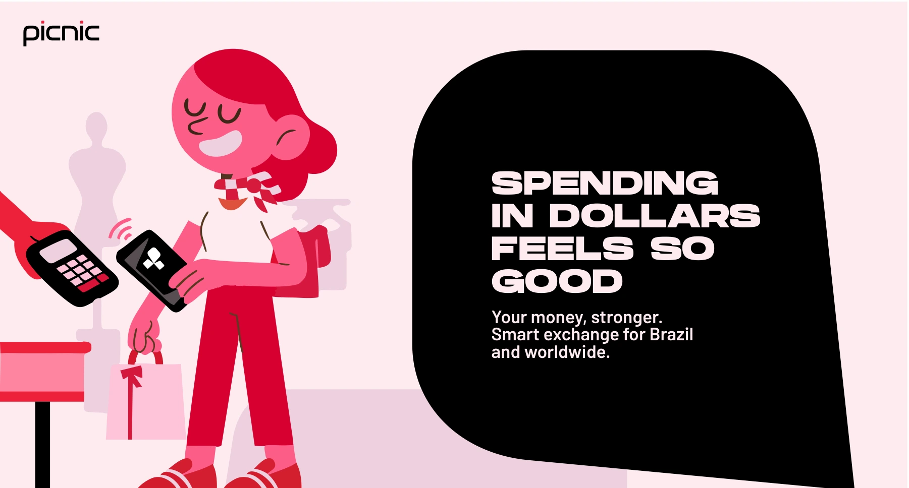
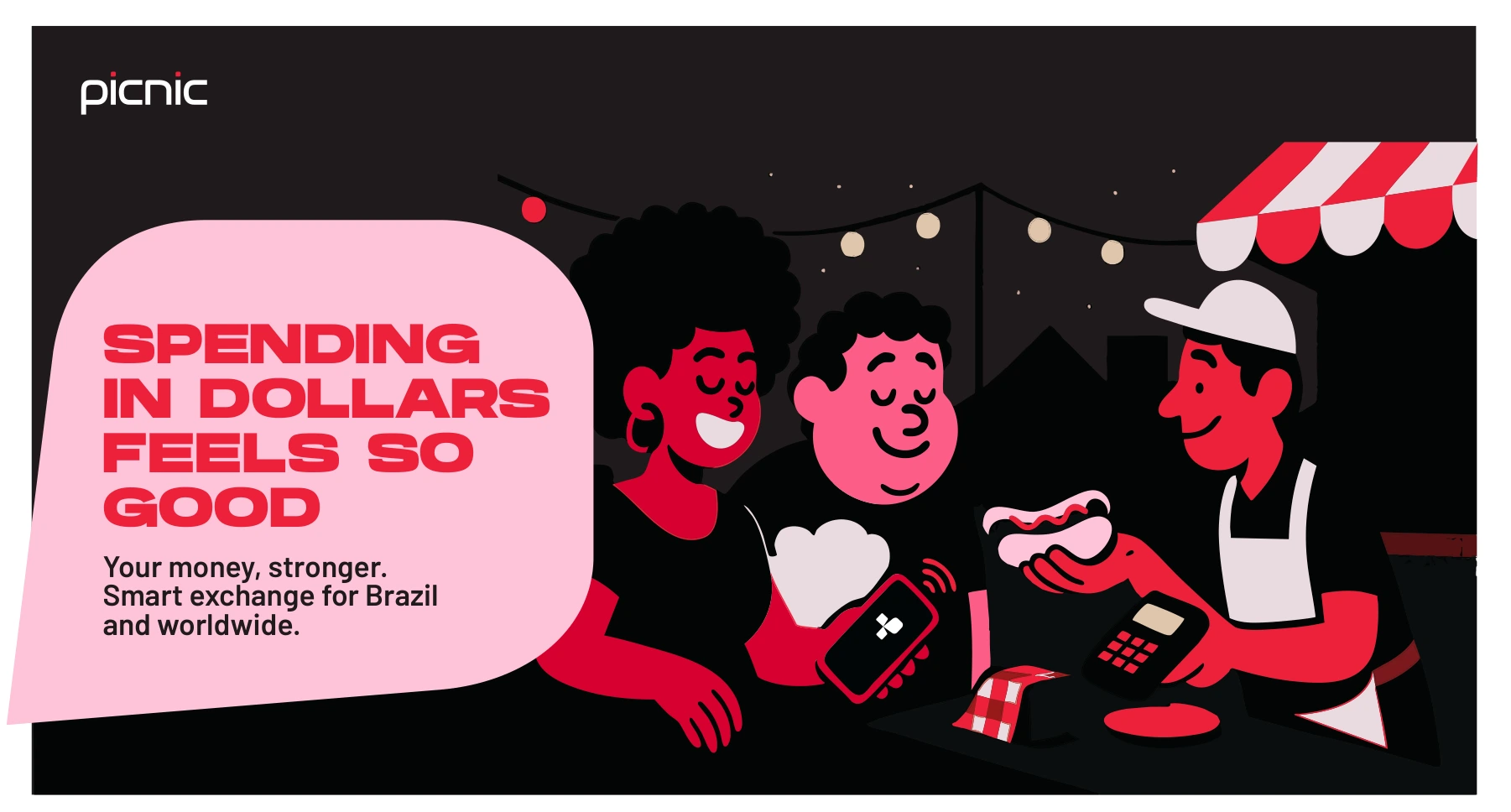
More than
one key visual.
I developed English and Portuguese messaging explorations alongside the visual system. The work connects the idea, copy, illustration and layout, giving the team a starting point for the next campaign and its adaptations.