
ONE BRAND.
MORE REACH.
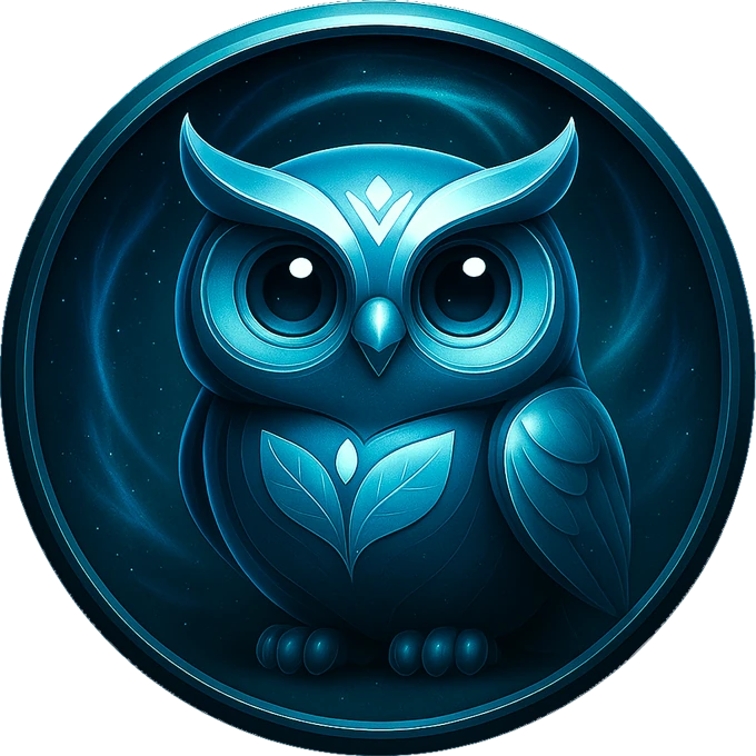
Revani needed a recognizable identity for its health-focused communication and digital rewards. I connected them through one visual system and a character the team could keep using.
Give Revani a distinct identity that could connect its health-focused communication and digital rewards.
A consistent identity, reusable character, OAT applications and a ChatGPT workflow for the team.
One identity, from the symbol
to the character.
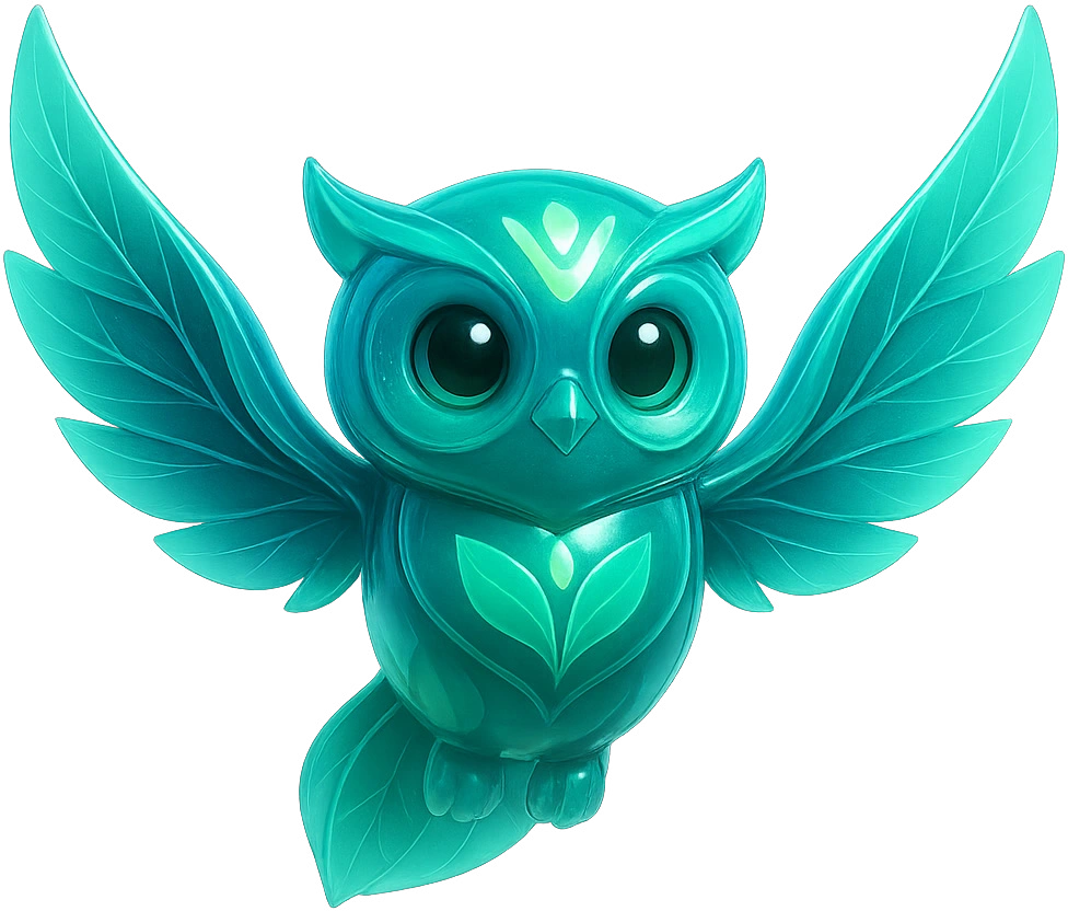
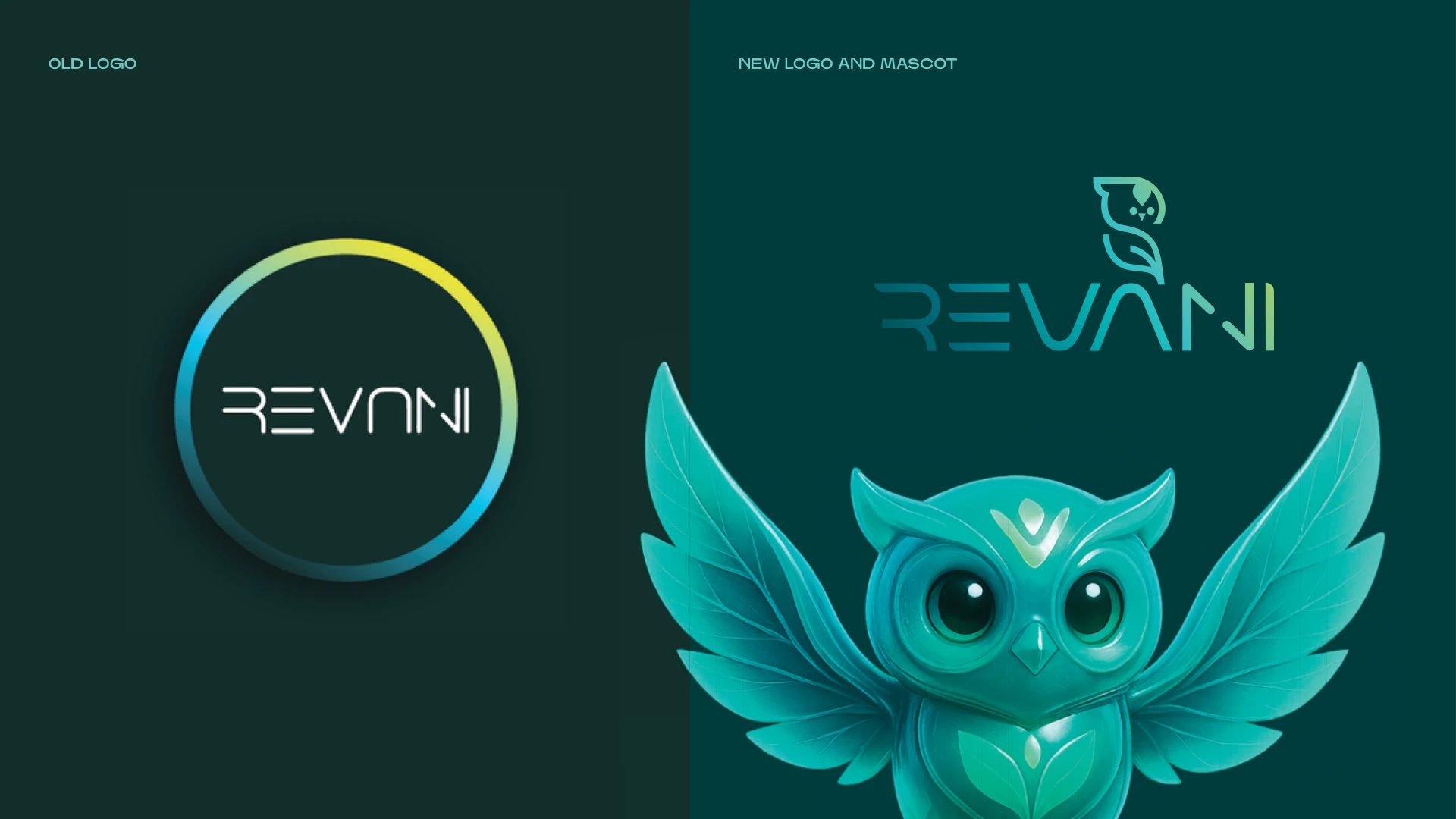
A growing ecosystem.
A shared identity.
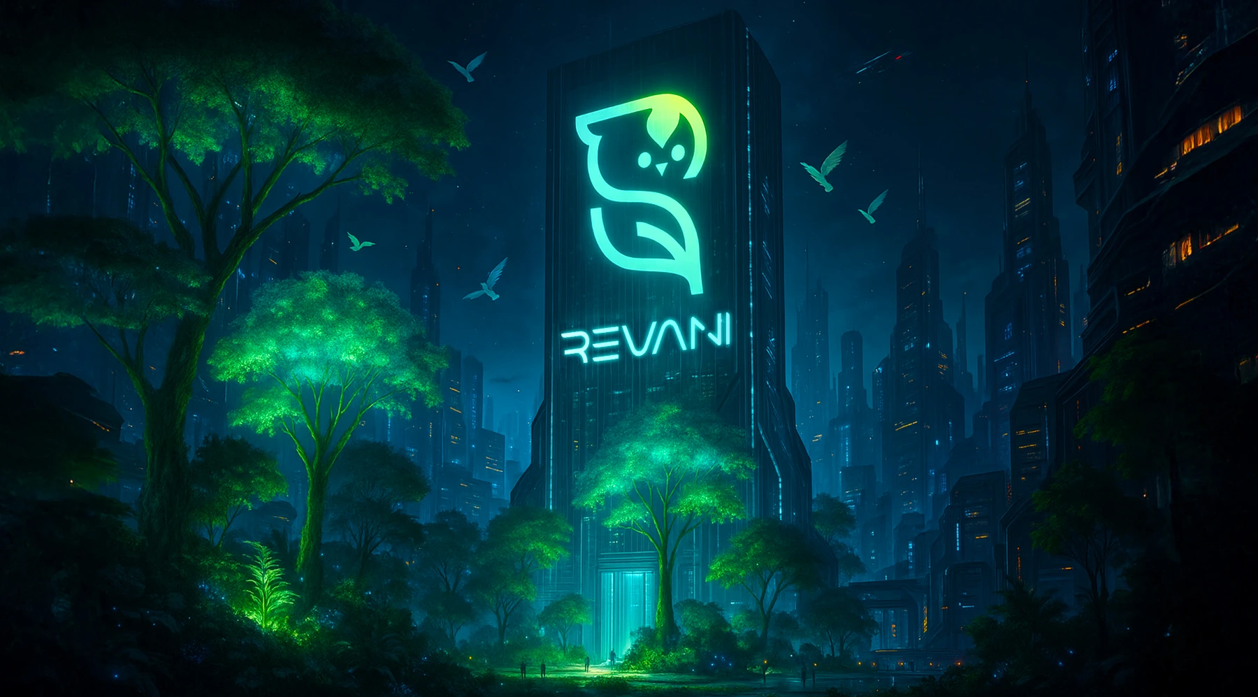
Revani’s communication needed a personality of its own. The rebrand gave it a consistent symbol, wordmark and Vee, a character that connects its content. Revani continues to use the identity and owl in its communication on X. That ongoing use gives the brand a familiar face across posts, instead of starting from a generic visual each time.
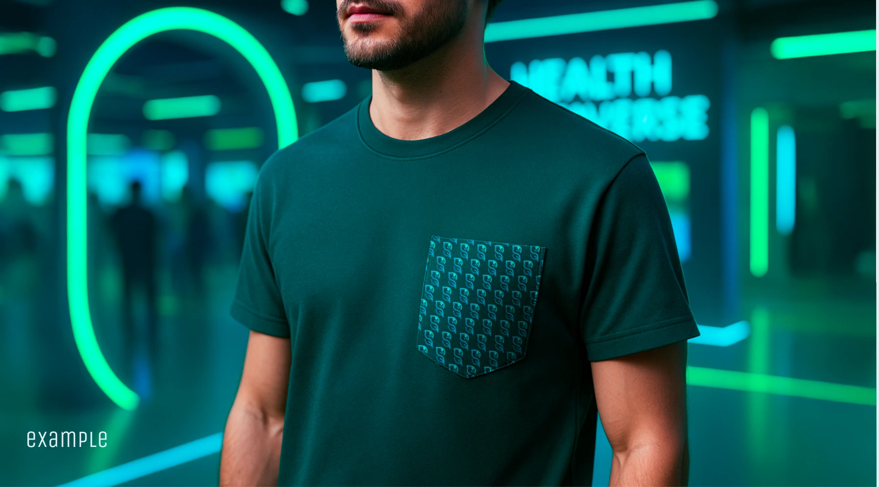
Distinct at every scale.
Why the owl
is the user.
The obvious mascot for a health brand is a doctor. I argued against it before drawing anything, for 4 reasons.
- A doctor makes the user someone who waits for instructions.
- It puts the responsibility for your health on someone else.
- It limits the brand to clinical authority, while Revani also communicates through everyday habits and digital rewards.
- And a doctor can’t carry a story about daily habits, which is where the rewards happen.
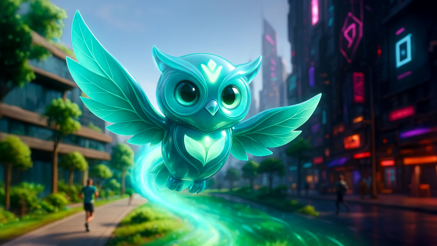
So Vee is the person using Revani. Health professionals still show up, as people Vee trusts.
Revani accepted the direction in the first presentation.
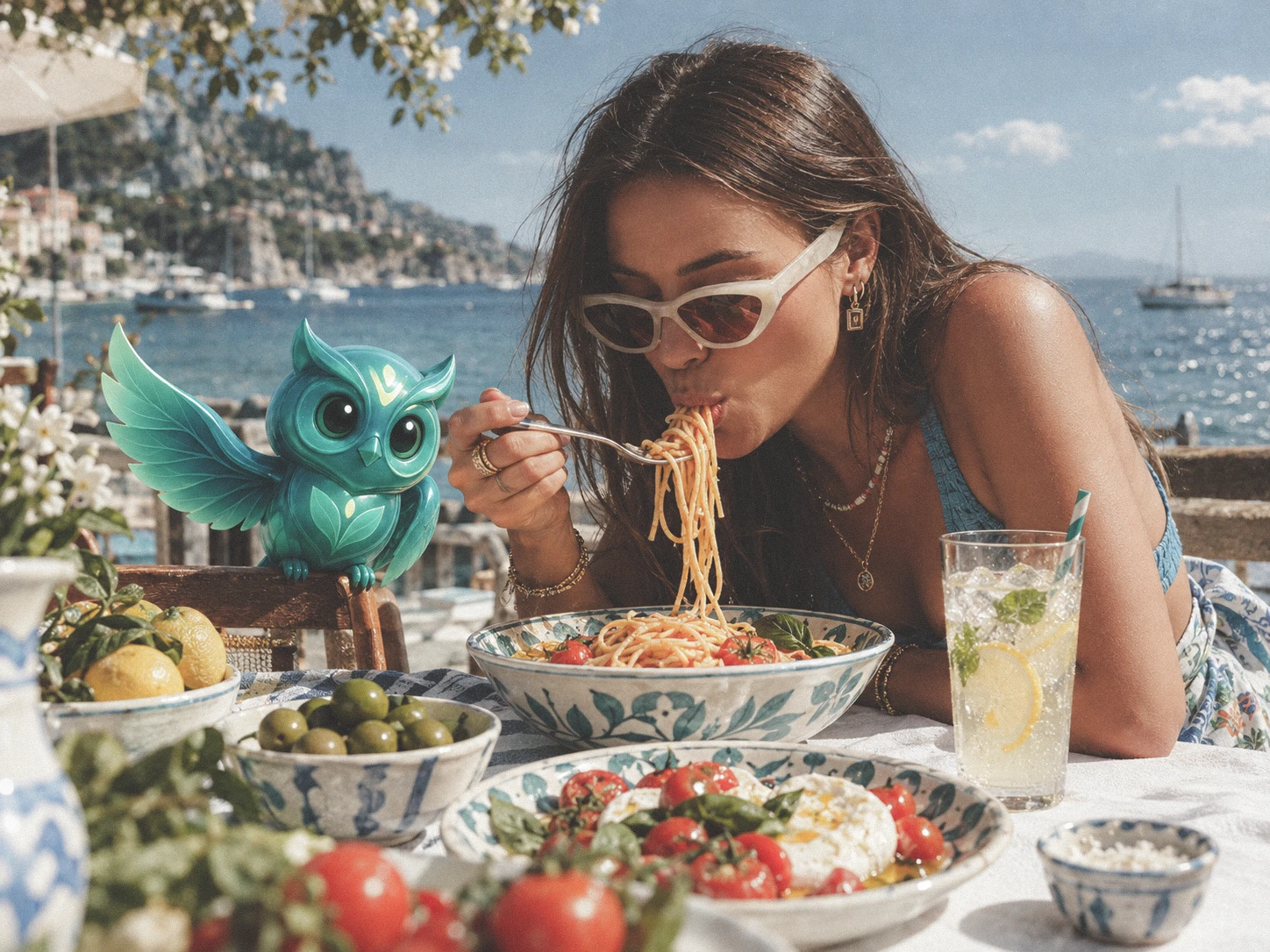
One character.
Many expressions.
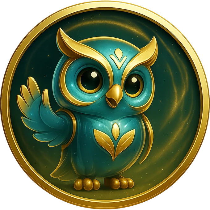
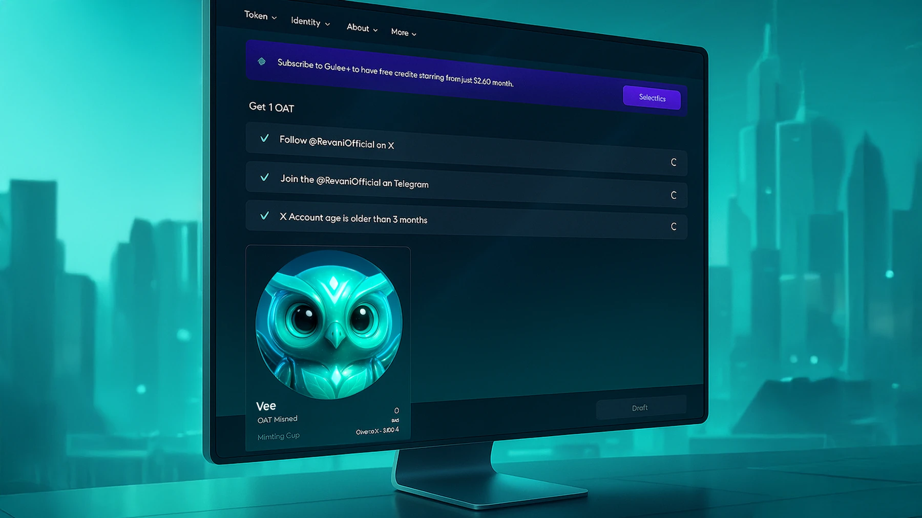
Vee carries the identity into a collection of digital rewards. Different expressions, colours and details make each edition part of the same world.
Explore the collection ↗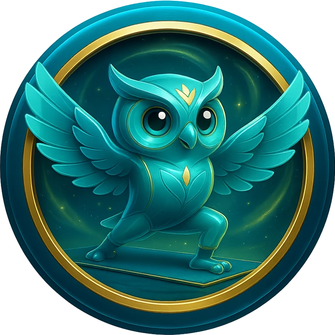
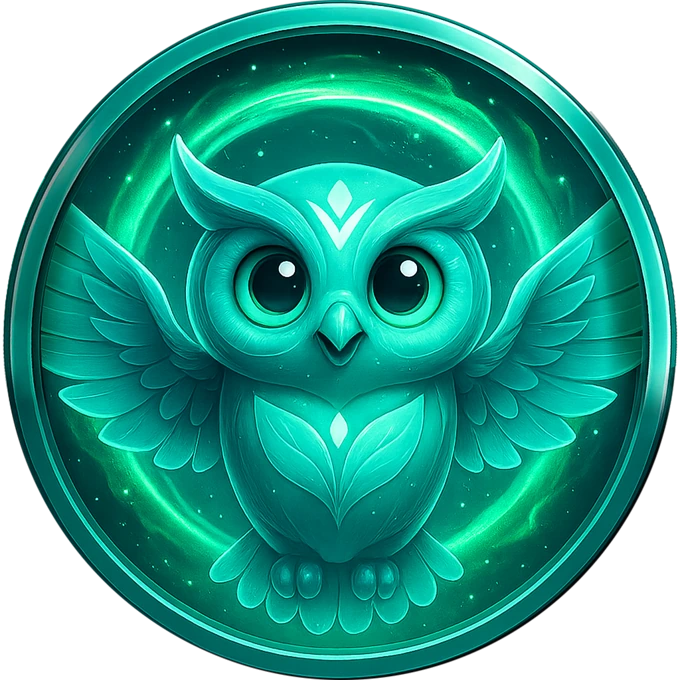
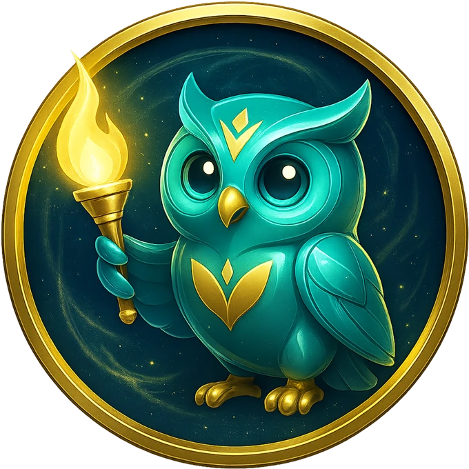
Vee, made by
the team.
Revani has the same kind of ChatGPT workflow I built for FFGI, set up for Vee. Revani still posts with Vee on X.
How the workflow works ↗
 Gift Horse↗